blog

Chart of the Month: September 2023

September 14, 2023

Down and to the Right: Assessing Western Europe Alternatives by Investment Style

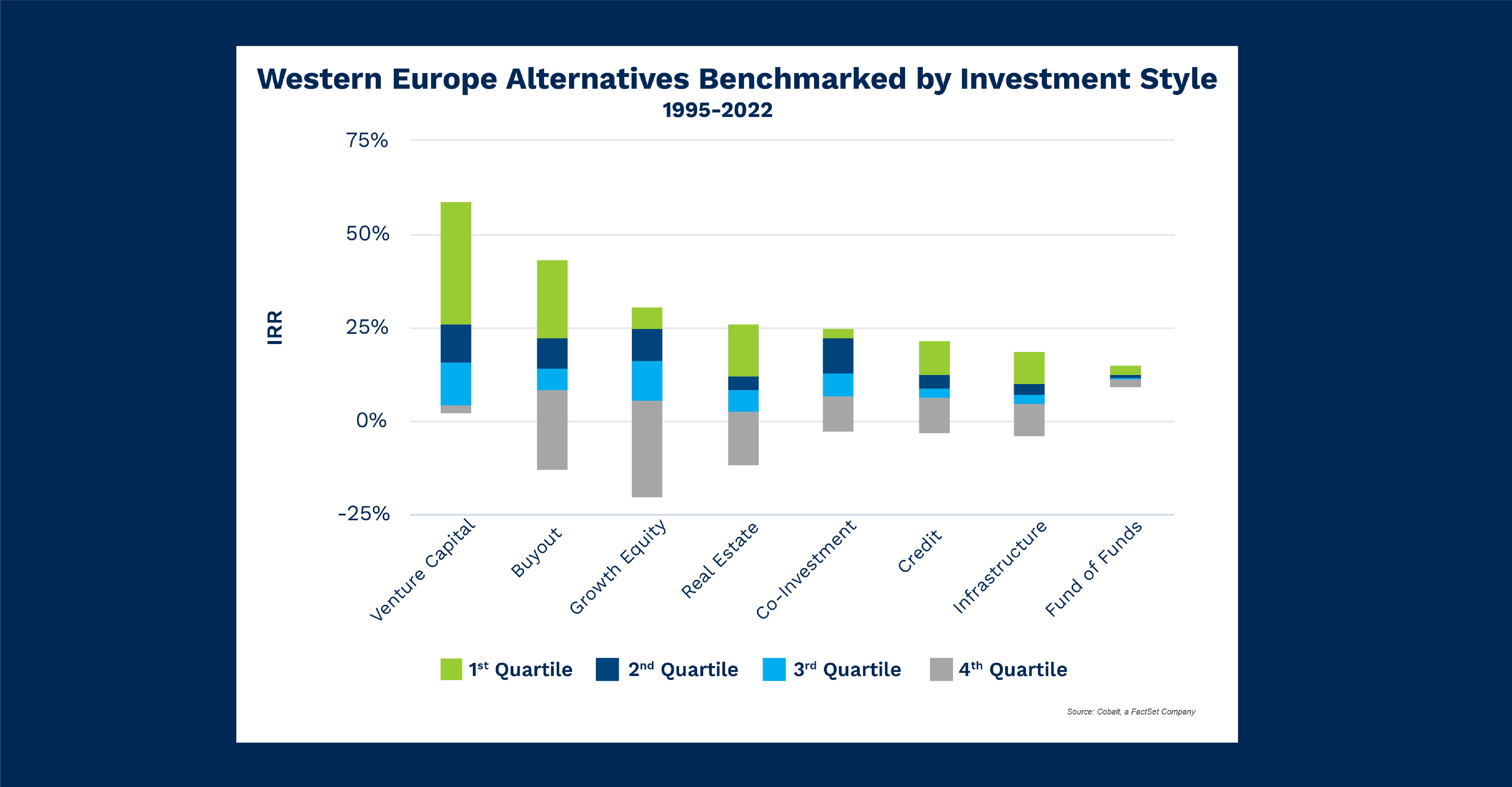
After a recent portfolio monitoring client win in Spain, we decided to review Western Europe for this month’s analysis on alternative fund performance. In the chart below, the Q4 benchmark for each investment style illustrates how a Limited Partner (LP) may assess their portfolio weightings in the region 

Key Takeaways

Unsurprisingly, venture capital and buyout funds have the highest first quartile returns. However, the roles are reversed on the downside: Venture capital remains completely above a 0% return, while buyout funds have more risk of not returning an investment. This highlights that ingrained trends often appear in the aggregate, but focusing in on a specific region may expose deviations from the norm.  

The largest investment styles in the alternative fund space (venture and buyout) offer the highest returns, but they are joined by growth equity and real estate, two other styles that have the highest upper fences of the benchmark. It’s important to note that co-investments are just behind real estate in this regard, having a higher first quartile floor. 

The investment styles with lower fence bounds (credit, infrastructure, fund-of-funds) do offer the benefit of tighter overall benchmarks, meaning an LP may have a better idea of their overall return when investing in these styles. Fund-of-funds exemplifies this best, with only a 6% difference between the upper and lower-fence of the benchmark. 

Looking Ahead

It will be important to keep in mind U.K.’s continued struggles with inflation when observing the next trends in Western Europe. Most other major economies have reduced or muted the effects of inflation at this point, while the U.K. may still be mired in a macro climate that’s less friendly to alternative returns. 

With a more volatile environment, it will be interesting to see if the unexpected observations in the venture capital and buyout lower quartile returns revert back to the average benchmark moving forward. 

This blog post is for informational purposes only. The information contained in this blog post is not legal, tax, or investment advice. FactSet does not endorse or recommend any investments and assumes no liability for any consequence relating directly or indirectly to any action or inaction taken based on the information contained in this article.
blog

Chart of the Month: August 2023

August 11, 2023

Alternate Current: Studying the Early Divergence in Energy Market NAV vs. Dry Powder 1995-2022 

The energy market is consistently prone to violent price swings in reaction to global news. As a result, it’s a difficult style to invest in safely and steadily, despite its ever-growing demand. As follow-up to our June analysis, we‘re looking at more investment styles that deviate from overall trends. As shown in the chart below, Energy varies from other private market trends by splitting the tether between NAV (net asset value) and dry powder at an earlier date and higher ratemore than any other style. 

Key Takeaways

Let’s look at the difference in dates. The main market divergences between NAV and dry powder were in 2009 and 2020. These were significant investment inflection points, and in both cases, NAV began to rise beyond dry powder levels as investors spent down the latter to invest into these distressed markets. We can see this reflected in the chart above as well; NAV briefly exceeds dry powder levels from 2010 to 2015 and then accelerated in 2020. 

However, between 2015 and 2020, there is a massive rise in NAVs as investors spent down dry powder amid a globally declining energy investment period and historic drops in oil prices. One explanation for the rise was the push for renewable energy sources, such as solar, that began to grow in 2016. In addition, cost-saving measures pushed renewable costs closer to and then below parity with fossil fuels. (Take a look at the Energy Infrastructure Funds raised.) Those opportunities may have attracted the remarkable investment. And as the demand for new or divested energy is constant, so too is the appetite for additional investment in this space. The environment at the time could have signaled investors to go all in and spend down their dry powder. 

Looking Ahead

As we alluded, even with the steady march of technological progress, the energy space is subject to strong macro fluctuations. Economic downturns or another pandemic could easily sideline energy demand and pricing in the medium term. Despite the risks and the tribulations of 2020, appetite for this investment style has persisted and strengthened. This gives credence to the sustainability of this wave of investmentas long as dry powder reserves remain. 

This blog post is for informational purposes only. The information contained in this blog post is not legal, tax, or investment advice. FactSet does not endorse or recommend any investments and assumes no liability for any consequence relating directly or indirectly to any action or inaction taken based on the information contained in this article.
blog

How private equity firms can make software implementation a cinch

July 19, 2023

Successful implementation of investment portfolio management software isn’t just some ideal-state dream. It’s a must-have tool for any competitive private capital manager. And with some basic understanding and advance planning, PE and VC teams can avoid common implementation pitfalls and enjoy the efficiencies of modern portfolio management.

As a provider of investment portfolio management software, Cobalt has helped PE and VC teams of every size prepare for and executive successful software implementations. Here’s a sampling of the best practices we’ve learned along the way:

  • Define the business objectives of implementation. What does your company aim to accomplish by adopting new systems? How will workflows improve? What does success look like? Without clear goals, implementation can miss the mark on strategic outcomes.
  • Cement a go-live date and stagger deadlines—and plan for workload surges. A detailed schedule with department-specific expectations will help you meet target dates. Recognize that extra effort will be required to get new systems off the ground—so consider allocating extra manpower during implementation to avoid overworked staff, missed deadlines, or both.
  • Outline your strategy for managing historical data. Existing data will need to be loaded into your new system. Determine which data will be transferred and identify the locations of all data you will need. To ensure nothing gets overlooked, assign responsibility for each element of data to a specific team member.
  • Inspire your team. Humans chafe at change: Some resistance to your implementation objectives is par for the course. Limit opposition by ensuring that all members of your team will truly benefit from investment portfolio management software—and then communicate those benefits. Make sure all parties know how this shift will make their jobs easier.

Approaching software implementation with intentionality and foresight allows private equity and venture capital firms to reap the benefits of investment portfolio management software—from advanced collaboration capabilities and sophisticated analytics to streamlined reporting and personalized dashboards—with minimal discomfort.

To learn more about typical pain points during software implementation and how to avoid them, download our white paper, “The Private Equity Firm’s Guide to Painless Software Implementation.

blog

Chart of the Month: July 2023

July 17, 2023

Q4 Crunch Time: Revisiting 2022 Returns at Year-end 

Before we publish Q4 2022 benchmark in Cobalt Market Data, let’s revisit our February analysis of 2022 H1 distribution pacing by vintage year.  

As a refresher, our distribution pace analysis calculates distributions as a percent of net asset value of private market funds. Now we’re able to include H2 (Q3 & Q4) in our analysis to measure how 2022 returns stack up to historical trends and to assess how accurate our predictions were back in February.  

Key Takeaways

In Q3 2022, the average distribution pace of 3.1% was slightly below the 4% in Q2 2022. This tracks with the downturn across public markets in the same quarter (3Q22); the S&P 500 saw a 6.3% decline from July 1 to September 30.  Additionally, this was the lowest third-quarter pace since 2008 to 2010, a stretch of time with sub-3.5% quarters each year.  

Historically, the third quarter distribution pace is typically stronger than the first or second quarter. However, 2022 bucked the trend as the pace increased as the year progressed, with Q1 being the highest and subsequent quarters slowing. 

Q4 finished above Q3 at a 3.7% pace, but it was still lower than the first two quarters of 2022. It was also the lowest Q4 rate since 2010 as there was a distribution rate of at least 5% throughout that timespan.  

Overall, 2022’s average distribution pace of 14.9% is well below the previous 10-year average of 24.8%. The change in annual rate, along with the change in the typical quarter-to-quarter patterns in the market, shows that private equity was not immune to the economic uncertainty and volatility in the macro climate throughout that year. 

Looking Ahead

It’s tough to draw a direct correlation, but the last two analyses reveal that public markets can signify the distribution pacing patterns in the private markets. Based on the S&P 500, there was a 7.5% increase in the public markets during the first quarter of 2023. This could signal an increase in private markets distribution pacing for 2023, although several factors could counteract this. In addition, the collapse of Silicon Valley Bank may weigh on distributions in the alternatives space, namely venture and growth verticals. 

We will publish the Cobalt Q4 benchmark data in the coming weeks, at which point we can dig deeper into the overall trends of private markets in 2023. 

This blog post is for informational purposes only. The information contained in this blog post is not legal, tax, or investment advice. FactSet does not endorse or recommend any investments and assumes no liability for any consequence relating directly or indirectly to any action or inaction taken based on the information contained in this article.
blog

Chart of the Month: June 2023

June 14, 2023

The Bridesmaid: Secondary Liquidity Investment Trends from 1999-2022 

Wedding season is in full swing, and as many are searching for cheap suits and flights, we’ve looked at an alwaysinvestedin butneverobsessed over style: Secondaries. To gauge investor interest and cyclicality, we used Cobalt market data to compile the distributions and contributions in the secondary fund universe against buyout funds (which we feel is representative of the overall private market trend). This analysis gives a sizeagnostic sense of how investors pay in, and how they are paid out for their choices. 

Key Takeaways

To start, let’s dive into buyout fund liquidity over time. This is representative of the general liquidity cycle of private markets over the past 20 years. Most mainstream strategies (excluding Secondaries, Infrastructure, and Natural Resources) follow the pattern in the chart above. The overall private market investment cycle is characterized by higher contributions during and following recessionary events (2000-2003, 2007-2010) and higher distributions immediately after the recovery (2004-2005, 2011-2018). This implies a cyclical approach to private market investments. Investor interest is counter-cyclical, with investment surges resulting in payoff surges about five years later when the funds begin distributing. 

So, why and how do secondary funds break the overall private market trend? As seen in the chart, Secondaries roughly follow the same pattern of investing during economic downturns (with more distributions coming out of these downturns), but the scale of distributions is heavily muted compared to the benchmark.  

One explanation for this is the scope of secondary investing trending upwards, with NAVs increasing since 2006. Total secondary fundraising in the 2000s was only $85B, compared to $335B in the 2010s. As a result, the significance of $2B excess contributions is much greater in 2008 when total contributions and distributions are around $3B. Conversely, in 2013 $2B excess distributions are compared to more than $12B total. The result is the diminution of the liquidity ratios following the 2008 recession seen in the chart above. 

Looking Ahead

It’s clear that secondary funds have been a popular investment strategy amidst the Covid-era drawdown. This is in line with the broader market, but combined with rising NAVs proportionate to contributions we could anticipate another disruption of the cyclical pop as distributions will be paid out in the coming years. This will likely be overshadowed by the volume of investment, yielding a “surprisingly” subdued liquidity ratio. 

However, apart from appearances, this does not reflect the investment style performance and the ability to generate returns, as the increasing popularity is reflective of Secondary’s relatively similar performance to the rest of the private markets. 

This blog post is for informational purposes only. The information contained in this blog post is not legal, tax, or investment advice. FactSet does not endorse or recommend any investments and assumes no liability for any consequence relating directly or indirectly to any action or inaction taken based on the information contained in this article.
blog

Software for Investment Portfolio Management Eliminates Private Capital Busy Work

May 16, 2023

Software for investment portfolio management eliminates busy work. Here’s how.

An overhaul for private capital firms

The phrase “investment portfolio management” calls to mind sleek offices with gleaming monitors and sophisticated professionals. Indeed, private equity and venture capital are elite fields, populated by some of the most agile minds. You’d be forgiven for assuming that specialized software for investment portfolio management is de rigueur. But beneath the glossy patina lies an unspoken truth: In many ways, private capital firms are stuck in the Dark Ages. (Or whatever you call the 1990s.)

Contact Cobalt Now

The data management status quo

Due to a combination of inertia, tech ambivalence, and aversion to big spends, private equity and venture capital firms have clung to decades-old operational practices. Many continue to rely on spreadsheets and other subpar data management methods to handle streams of fund and portfolio company information crucial to their businesses.

Ongoing reliance on spreadsheets invites inaccuracies, perpetuates inefficiencies, and burns brainpower. And, in firms that have yet to adopt software for investment portfolio management, such problems are not isolated to a single department: Teams across private capital firms contend with tedious tasks, risking potentially disastrous fallout. Consider:

Deal teams moving data

Members of deal  teams do more paper-pushing than they’d care to admit. Deal teams need to track portfolio company financials, often through a constellation of spreadsheets: Portfolio companies send over metrics in their chosen format. Deal teams move that information into their organization’s internal spreadsheets. The data may then be moved yet again to a sheet for comparing deals.

When one considers how many portfolio companies are being monitored, that’s a lot of time spent relocating data. What’s more, all that movement can turn a firm’s clean data into an error-ridden mess. Meanwhile, deal teams  who use software for investment portfolio management can spend more time actually sourcing deals, giving them a competitive advantage.

Finance teams ferrying figures

From valuations to back-office accounting, finance teams are collecting and manipulating huge amounts of data. Beyond comparing balance sheets for valuations, they also project cash flows, evaluate potential scenarios, and consider how investors value comparable companies. And, internal accounting requires finance teams to gather even more figures on a regular basis. 

Recognizing these drags on employee productivity, leading private capital firms are embracing software for investment portfolio management that easily ingest data and store financials—improving productivity by wide margins.

Investor relations teams gathering records

Keeping investors informed of portfolio company performance involves handling data requests (read: scouring spreadsheets for very specific information). It also means providing regular reports (read: manually preparing tear sheets and cash flow summaries).  And LPs want track records of existing funds, which entails…you guessed it.

For these teams, software for investment portfolio management is a godsend. Best-in-class systems automatically generate tear sheets and reports, freeing up IR teams for higher-level tasks.

Leading private market firms are saying sayonara to manual processes and adopting software specifically designed to automate investment portfolio management and create workflow efficiencies.

Want to learn more? Download our latest white paper, The GP’s Guide to Productivity:

blog

Chart of the Month: May 2023

May 3, 2023

Through the Grapevine: A Hypothesis in North American Infrastructure Trends Q1 2006-Q4 2015

Infrastructure is a vertical we often analyze as it exists in a middle ground between mundanity and innovation. And the motivations for its investors can vary within that middle ground. We investigated infrastructure fundraising in 2021 and have had a nagging curiosity about the lone peak in 2008 fundraising ever since. The Great Financial Crisis tends to explain many trends around that time, but we looked deeper and charted the rate of return against the total net asset value (NAV) in North American Infrastructure investment to see if performance could be a driving component of the 2008 peak. 

Key Takeaways

First, let’s look at the total value plot. We see an inflection point in Q2 2008 when the nearly flat curve of total NAV begins to increase at a rate that is sustained throughout the next decade. Indeed, our prior analysis confirmed this and showed sustained growth in infrastructure fundraising in the 2010s. The chart above gives us the “switch flip” moment to reveal how this upward trend changed rather quickly. Given this occurred in 2008, there is a myriad of possible explanations: a flight from credit and real estate to safer investments, an assumption that post-recession investment could consist of higher national infrastructure spending (both civil and energy), for example. 

Secondly, let’s examine the rate of return plot. The returns are consistent and generally positive from 2006 to 2015. However, there are noticeably larger, positive returns in the leadup to the inflection point in 2008. In 2006, the chart shows some large returns relative to the average, culminating in a massive return spike in 2007. Now, these are almost certainly products of sample size: single funds delivering outsized returns relative to a smaller population of funds in our database at that time. Regardless, the correlation is quite striking, and tempts one to postulate if fund managers at the time heard of the high individual returns and tried to pile into the space to capture excess return. This would inflate the NAV but flatten the returns as average performance decreased. Of course, the answer is likely a far more complex combination of factors. 

Looking Ahead

While this chart analysis ends in 2015, it gives us insight into the potential direction of future investments. Today, infrastructure is still an expanding investment style, as energy diversification alone continues to pull more and more interest.  And as infrastructure begets maintenance, investment can be a self-spending prophecy the more it increases. 

From a performance perspective, we no longer see wildly outsized infrastructure returns like in the chart above. However, we still see strong and safe average performance from this style, implying the suppressed performance in the wake of the Great Financial Crisis may have been an anomaly. 

This blog post is for informational purposes only. The information contained in this blog post is not legal, tax, or investment advice. FactSet does not endorse or recommend any investments and assumes no liability for any consequence relating directly or indirectly to any action or inaction taken based on the information contained in this article.
blog

The PE Tech Dilemma That Isn’t

April 27, 2023

Finding the Best Portfolio Management Software

The private equity and venture capital world is divided into two groups of people: old-guard defenders of Excel spreadsheets and reform-minded advocates of portfolio monitoring software.

Are we being dramatic? Maybe. But debates around the relative merits of Excel spreadsheets and finding the best portfolio management software are happening at PE and VC firms everywhere. It’s a serious question with major implications for productivity, data accuracy, and workflow optimization. And while the right answer undoubtedly varies from firm to firm, considering both sides of the argument offers a useful lens for examining your own organization’s data needs.

Despite our being a portfolio monitoring software company, we’re not insensitive to the arguments wielded by spreadsheet defenders, including these:

  • Spreadsheets are a known entity. There’s no denying there’s comfort in the familiar. For a long time, Excel spreadsheets have been the bread-and-butter of investment management. And their usage is intuitive to anyone born this side of 1970. 
  • Spreadsheets allow for data manipulation to meet diverse needs. Many firms have an (unofficial) resident Excel whiz adept at arranging data for various reporting functions. From collecting quarterly financials to meet LP data requests, to preparing sheets with customized metrics to compare portfolio company performance—Excel offers endless ways to organize numbers for meaningful analysis.
  • Spreadsheets can become highly-designed, tailor-made templates. For formats used over and over again—quarterly reports, portfolio company tear sheets, etc.—many PE and VC firms use Excel (and other Microsoft Office tools) to create templates with spacing, fonts, and designs that match their brand identity.

Of course, advocates of portfolio monitoring software have their own set of talking points, such as:

  • Portfolio monitoring solutions offer real-time data. These next-gen software systems function as a single source of truth, ingesting fund and portfolio company data into a centralized database and ensuring constant accuracy. No need to manually update information across multiple files
  • Portfolio monitoring solutions automatically generate reports and interactive dashboards. Whether you’re working on cash flow calculations or scenario modeling, portfolio monitoring solutions automatically configure data in innovative ways, streamlining any analysis.
  • Portfolio monitoring solutions simplify creation of custom metrics and KPI tracking. Users can create and manage financial and operating metrics for portfolio companies. Each team member can view KPIs relevant to their role. And with best-in-class portfolio monitoring solutions, employees can also track the history of a given metric over time.

The good news? This battle need not end in a stalemate. At Cobalt, we believe even the best portfolio management software need not totally supplant spreadsheets. It is our belief that the marriage of the two is often the best way to enjoy the benefits of each. 

Leading portfolio monitoring solutions offer plug-ins that allow users to seamlessly send data between Excel spreadsheets and software systems. This way, trusty standbys can remain in use, but fueled by more accurate data and more efficient processes. For more on the ways portfolio monitoring software augments the power of your spreadsheet, read our white paper, Four Excel Power Hacks for Fund Managers.

blog

Chart of the Month: April 2023

April 4, 2023

March Sadness: Assessing the Growth & Venture Landscape After a Tumultuous First Quarter

The first quarter of 2023 has come to a close, ending an impactful three months that sustained many different news cycles: rising interest rates, an equities rally, and most recently, the demise of Silicon Valley Bank (SVB) and its far-reaching implications. As we continue to assess the aftermath, we examined the state of venture capital and growth equity, spaces both closely associated with SVB. Today, we’ll investigate the net asset values (NAVs) and dry powder since 2000 of these two investment strategies, to see what lessons can be taken from the historical data. 

Global Venture Capital Fund Performance Metrics

Key Takeaways

The most striking aspect of the above chart is the dramatic rise in both NAVs and dry powder between mid-2020 and the end of 2021. Even compared to previous charts examining NAVs and dry powder in this time frame, the venture capital  and growth space stands out. NAVs more than doubled in this time frame, from $215 billion to $460 billion, with dry powder experiencing a less dramatic but still significant increase as well ($115 billion – $195 billion). 

The reasons behind this dramatic growth are mostly the same across the board: a low interest rate environment and historic amounts of capital being injected into the economy created an “everything rally” period for 2 years, which we see exhibited here. Venture and growth were particularly primed to capitalize even more than other strategies on this. Tech and quick growth, the main beneficiaries of the post-March 2020 period, are the focus of most of the space. 

Looking Ahead

2022 and the beginning of this year were already creating an unwinding of sorts from the post-March 2020 frenzy in the markets. The instability in banking in both large institutions (e.g., SVB, Credit Suisse) and regional institutions has accentuated the uncertainty of the markets for the next few years. 

For VC a growth, there’s a good argument to be made we will continue to see an unwinding in dry powder and NAV that have been exhibited the past few quarters. GPs may begin to act more cautiously with the portfolio companies they look at, potentially limiting performance upside. LPs may likewise look to de-risk their portfolios, which may cause a shift from the riskier end of private investments. 

This blog post is for informational purposes only. The information contained in this blog post is not legal, tax, or investment advice. FactSet does not endorse or recommend any investments and assumes no liability for any consequence relating directly or indirectly to any action or inaction taken based on the information contained in this article.
blog

Chart of the Month: March 2023

March 8, 2023

Ambition and Caution: A Comparison of Buyout and Venture Returns from 1998-2021

Given the wild drawdown in 2022, we analyzed where seasick institutional investors could bolster the stability of their portfolios. We used a wide lens to determine the performance and stability of investments in the two most popular styles in North Americabuyout and venture capital. We compared their total value to paid-in capital (TVPIs) between 1998 and 2021 to see the returns each investment style might offer to investors moving forward. 

Key Takeaways

Buyout TVPI has a surprisingly stable history. Through two separate drawdowns from 1999-2008, the average buyout fund held above a 1.5x return on its investment. Funds quickly rebounded from these lows, gaining around 0.25x on average from the lowest point. This consistency in performance extends to the 2010s when buyouts once again gained momentum and peaked around a 2x return. Lower returns in the final years of the sample set above are expected due to the drawdown of the 2020s and the fact that these buyout funds have yet to yield fully on their investment. One reason for this consistency is the buyout’s relatively safe investment focus: investing in established firms that are not necessarily cyclical. 

On the other hand, venture capital has (unsurprisingly) a highly volatile history. The Dot Com bubble had a deleterious effect on venture fund valuations, where they dipped below a 1x return, resulting in the average investment losing money. While returns would quickly climb, they remained suppressed going into the Great Financial Crisis (2007-2008). However, coming out of it, we see the power of venture capital investing as returns catapulted to several multiples beyond the initial investmentand far beyond the average buyout return. Yet this launch was not without turbulence, as the yields see much higher volatility of return due to the riskiness of earlystage investing. Much like buyout TVPI, the more recent years reflect incomplete investing horizons for venture capital. 

Looking Ahead

At face value, these are hardly novel ideas. Experienced investors know that venture capital is risky, and buyout investing is relatively stable by comparison. However, visualizing these systems of consistency and opportunity offers perspective on where investors may look next. As we are once again working through a tumultuous economic period, we see investors presented with a familiar choice: ambition or caution.  

Will investors choose ambition over caution? Venture capital performed impressively after the Great Financial Crisis, and there is room for disruption following the recent tech drawdowns. But, given the volatility of venture investing, some investors may wish to refrain from stacking additional risk on their plate. They may also choose caution. Buyout has shown incredible consistency in and out of recession, and will on average yield a positive—but not highest—return. 

This blog post is for informational purposes only. The information contained in this blog post is not legal, tax, or investment advice. FactSet does not endorse or recommend any investments and assumes no liability for any consequence relating directly or indirectly to any action or inaction taken based on the information contained in this article.